Victoria Park Community Centre
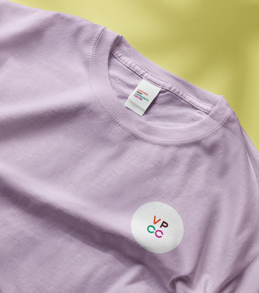
The Vic Park Community Centre, a thriving neighbourhood hub in Perth, has been fostering collaboration, imagination, and growth for the local community for over three decades. As the organisation reached its 30-year milestone, they decided it was time to have a visual identity that truly represented their vibrant spirit and dedication to the community. They approached a designer (me!) with a specialisation in handcrafted designs to create a lively and accessible visual identity, steering clear of corporate or governmental aesthetics.
Client
Victoria Park Community Centre
Category
Visual Identity, Print, Web
Location
Perth, Australia
The primary goal of the visual identity was to embody the essence of the community centre and its people:
- Bright and Joyful: The design needed to radiate positivity and happiness, reflecting the lively atmosphere of the community centre’s activities.
- Accessible: Following web contrast and color requirements, the design aimed to ensure accessibility for everyone, promoting inclusivity and equal participation.
- Humanmade and Welcoming: By incorporating handcrafted elements, the identity would exude a warm, approachable, and human touch.
- Non-Corporate/Governmental: To avoid an impersonal look, the visual identity should steer away from corporate or governmental aesthetics, focusing on unique, community-driven elements.
Design Approach:
Drawing upon the brief, I crafted a visual identity that perfectly captured the spirit of the community centre and its community:
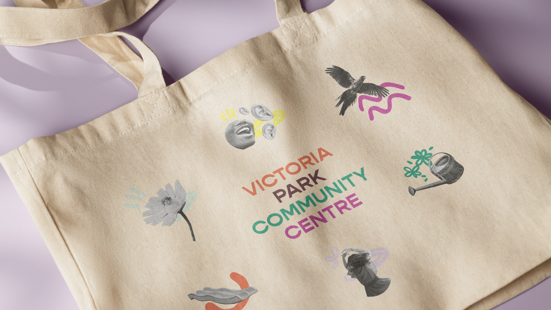
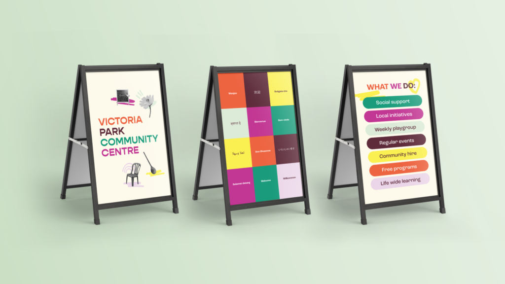
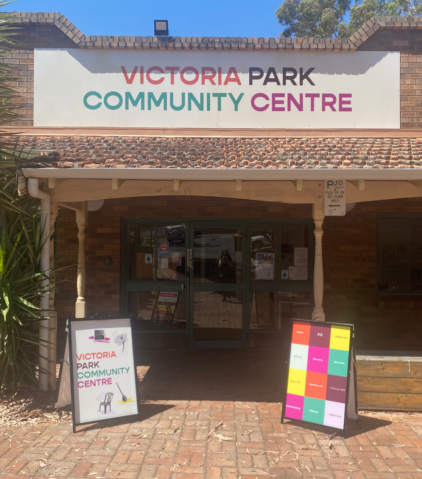
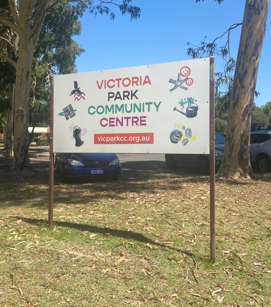
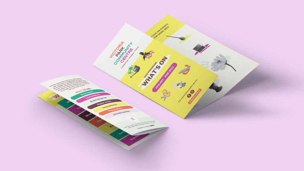
- Playful Collage Icons: The heart of the visual identity lies in a set of playful icons created in a collage style. These icons symbolise various activities and aspects of the community centre and give the impression that the community itself came together to craft them, emphasising the active participation of its members.
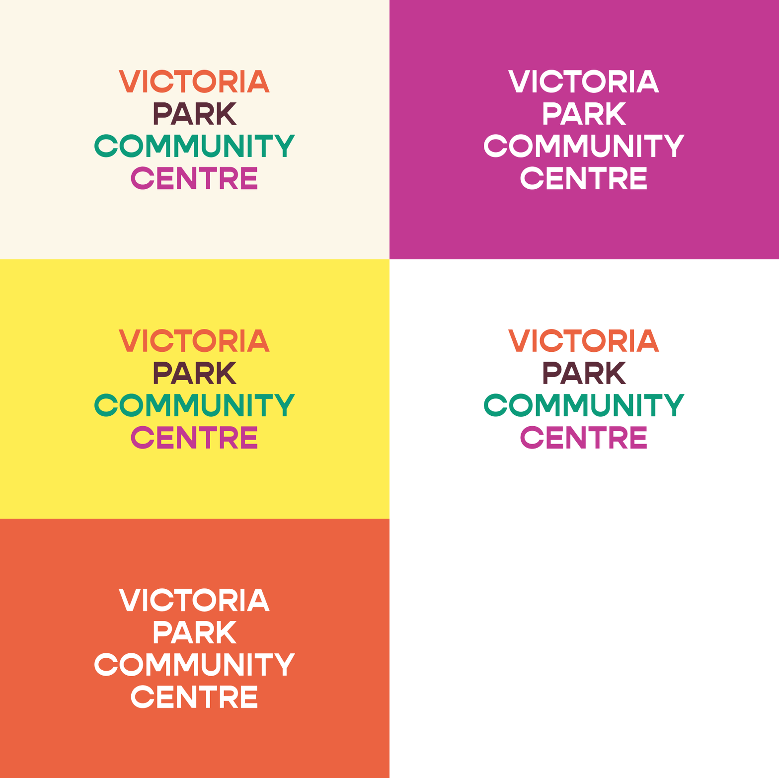
- Lively Colour Palette: The colour palette chosen is vibrant and lively, contributing to the overall brightness and joyfulness of the visual identity.
- Handcrafted Feel: By incorporating hand-drawn elements, the design achieved a humanmade and welcoming touch that resonated well with the community’s values.
- Practicality and Ease of Use: I ensured that the visual identity was practical for the team to implement across various touchpoints. This included the design of outdoor signage and templates for program flyers and presentations.
Website Redesign (soon to be launched!):
By collaborating closely with the community centre team, we worked on revamping the organisation’s website. The redesigned website aimed to better represent the vibrant spirit of the community centre, engage visitors effectively and provide easy access to program information and event details.
Conclusion:
The new visual identity successfully celebrates the Vic Park Community Centre’s 30th birthday while embodying its core values and lively atmosphere. The playful collage icons, vibrant colours, and handcrafted elements reflect the community’s active involvement in making the centre a welcoming space for all.The redesigned website serve as a fitting digital representation of the organisation’s dedication to providing exceptional activities and events for both children and adults in the local community.
To explore the exciting array of programs and activities offered by the Vic Park Community Centre, visit their website.


Kind words
Kerri Jefferis ∼ Manager at Victoria Park Community Centre